ReShield
In case you want a quick overview, you can check the video here.
ReShield (Acquired by Rubrik)
ReShield is an AI-native Identity and Access Management (IAM) SaaS product built for tech companies. It helps teams automate and secure access for both human and non-human identities, as well as automated systems.
I was the sole designer on the team, which meant owning the entire product design end-to-end, as well as handling brand identity, the website, and growth touchpoints (sales decks, investor decks, etc.).
The Problem
When I joined, the first thing I wanted to do was deeply understand the problem: What are we solving? Who are we solving it for? What already exists? What value are we providing to users? I ran multiple in-person sessions with the founders in the early stages, where we discussed all the open questions. We also spoke with potential customers to understand the problem from their perspective.
As organizations grow and adopt more cloud technologies, their data becomes fragmented across databases, cloud applications, and dozens of SaaS tools. Access requests and approvals are manual and slow, which results in both people and machines having more permissions than they need, often with permanent access. Security teams and admins lack consolidated visibility into who has access to what, which allows potential threats to go undetected. This issue is particularly relevant to non-human identities (NHI), such as API keys and service accounts.

Understanding the Users
Before thinking about solutions, I wanted to understand the users well and gain clarity on their goals. After speaking with potential users and brainstorming with the founders, we identified three primary user types

How are we solving:
Automating Access Request and Approval:
Instead of going to an individual resource or app to request or grant access, the entire tech stack is available on ReShield with a Slack-first approach.
Providing Full Visibility to Security Teams:
Users can view who has what access in the identity inventory or in the access graph by typing a query in plain English. AI-powered security insights find potential security threats and keep the security team updated via dashboard and Slack.
AI Workflows:
We have several AI-driven modules, such as access policies, access bundles, workflow creation, and access reviews, which help security teams set up access policies, create access review campaigns, and automate them.

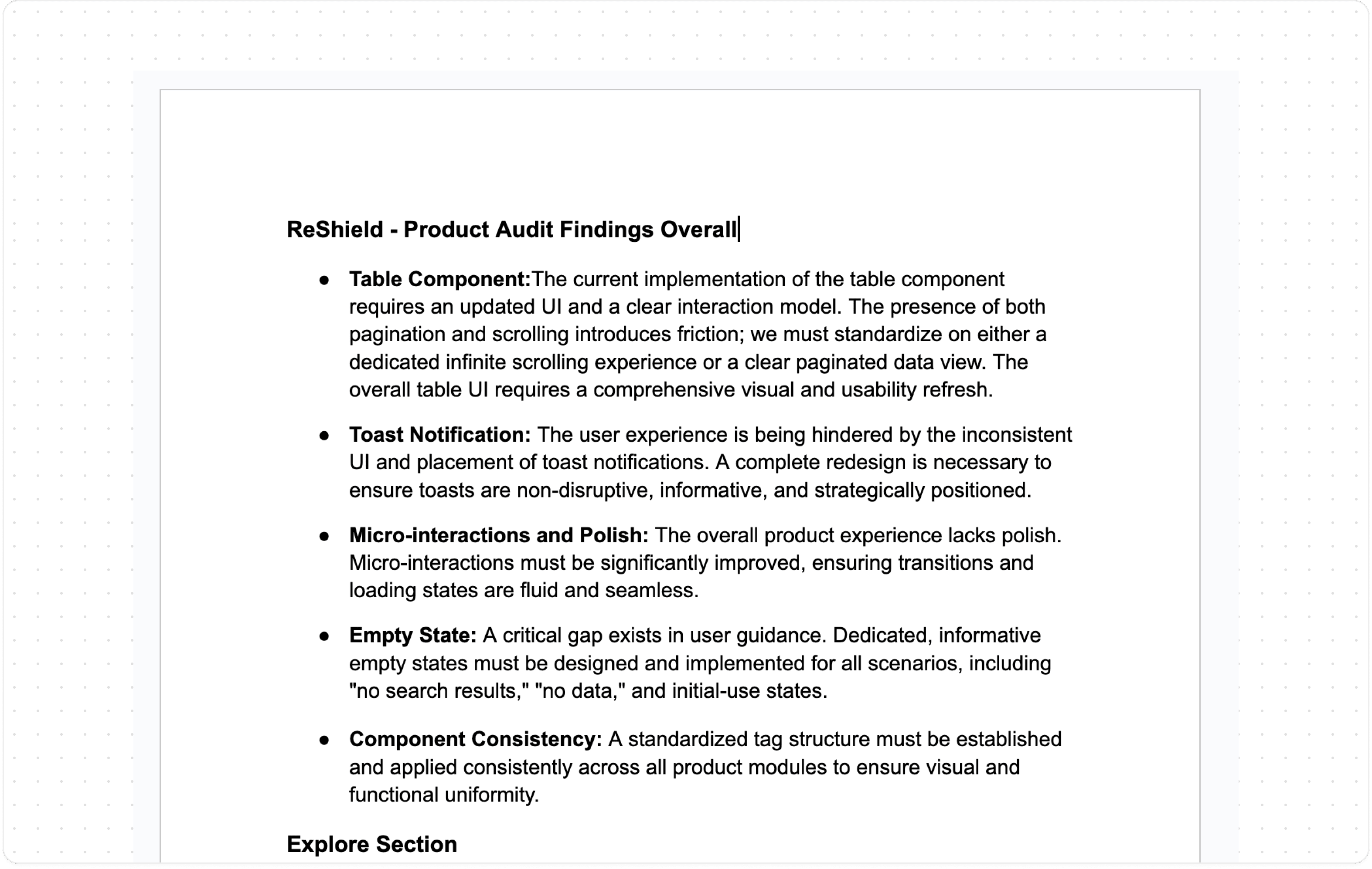
Product Audit
When I joined, the product was already live. It had been built without dedicated design involvement, resulting in significant gaps in both the UI and the underlying UX logic, which I documented.
I performed two audits: one immediately after joining, and another three months later when we had more context and development bandwidth. The first was focused on triage. Since we didn't have time for a full revamp, I concentrated on essential improvements and a UI cleanup. The second audit was the starting point for the actual redesign.
Redefining the IA & User Flows
Information architecture is the foundation. Poor IA makes a product hard to understand and creates compounding UX problems. I mapped out the existing IA and user flows end-to-end, noted every friction point, and used that as the starting point for redesigning both.
Redefining the user flows allowed me to think through edge cases, including how the UI should behave for simple workflows like adding an integration versus more complex ones like creating a policy or submitting an access request.
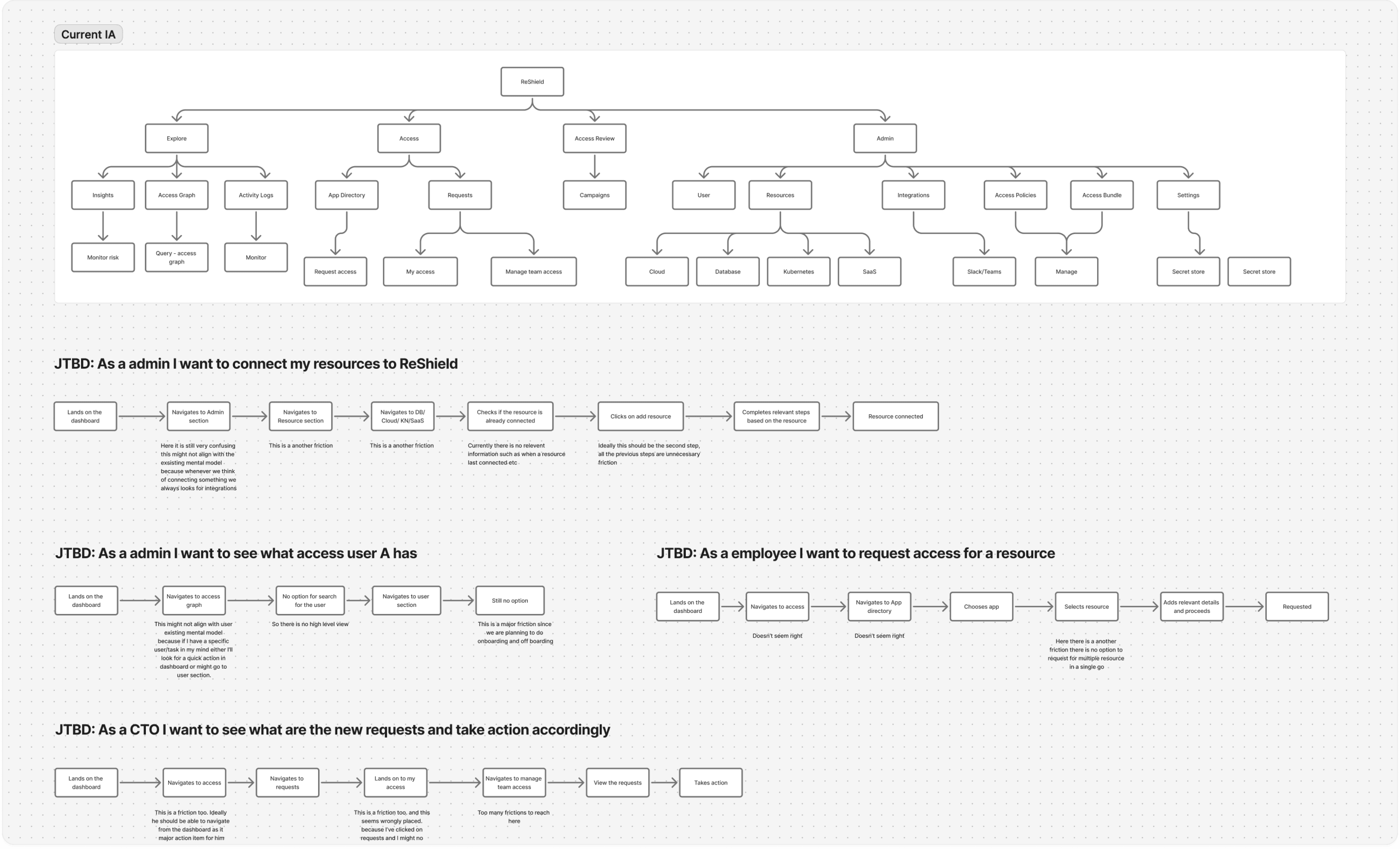
*You can see the revamped IA for all three personas here
Concept Exploration
I researched existing IAM products, dev tools, and other security platforms. Most existing products are complex and difficult to use, with few being well-designed. The challenge specific to ReShield was significant: compliance managers require a lot of data presented clearly, and the actions they take range from simple to very complex.
The most pressing problems we identified were:
Improving navigation.
Creating a scalable UI as the product grows.
Limiting multiple font variants usage.
Making the data easier to consume.
Making the workflows seamless.

Design Exploration for various modules
Design Decisions
Typography was the most critical decision, especially for a product like ReShield where users are constantly consuming dense data. I found that a 1px difference in size, combined with proper letter spacing and line height, had a significant impact on readability. After testing several iterations to get it right, I codified it into a system with clear guidelines.
The navigation bar was designed with a nested structure to clearly separate primary and secondary navigation.
In the older design, we had an issue with white space management, particularly with data tables. We needed to show dense data, but the available space was not utilized efficiently. For instance, excessive padding to the right and left of the table was ineffective. Therefore, I reclaimed that space and provided more breathing room between columns with an improved UI, which proved to be successful.
A Modal/nested structure was implemented for simpler workflows, such as integration, adding a new user, or requesting or approving access.
A Multi-step full-screen modal was designed for complex flows, such as access review campaign creation.


Design System
I built and maintained a lean design system, not comprehensive, but exactly what the product needed at this stage. The rule I stuck to: everything shipped had to come from the design system. If something new was required, I built the component first and then used it in the design, never one-off custom styles. This kept things consistent, easier to scale, and easier to build.
I also maintained a separate tracking sheet to make sure components were being implemented correctly by the dev team.
Insights
This section is designed for security teams. In the earlier version, the layout felt dense and overwhelming. Based on user feedback and internal discussions, we made three key changes: reduced unnecessary text, grouped insights by urgency, and provided a clearer overview of human and non-human identities and related resources. After launch, the updated design was better received and easier to navigate.

Integration
Integrations are a core part of the product, but not all resources follow the same setup flow. Cloud providers, databases, Kubernetes, and IDPs each require different steps and configurations. To simplify this, the primary navigation is organized by resource type. Each landing page provides contextual help, a clear overview of connected resources, and their current status. This structure reduces cognitive load and makes it easier for users to manage integrations across different systems.


Access Graph
Our AI-powered query graph allows users to explore their entire security landscape using natural language. I designed a structured view that connects users, groups, roles, and resources in a clear hierarchy, making complex access relationships easy to scan. Risk indicators such as “Overprivileged” are surfaced inline, and relevant actions appear contextually, enabling users to move from discovery to remediation without friction. Users can also take appropriate actions directly from this view as needed.

App Directory & Requests
The app directory provides users with a complete view of available resources, with frequently requested ones upfront for quick access. I designed the request flow to be seamless, allowing users to select an application and resource, specify duration and permissions, and provide context for approval in just a few clicks. We have similar flow within our Slack bot as well.


Request Approval
Resource owners can review and approve team requests. In My Access, users see their active permissions, access one-time credentials post approval, and track pending requests so they can follow up as needed.


Access Policy
Every connected resource requires an access policy. This is where users define who can request access, what permissions they can request, and who approves those requests. Admins can configure multiple approval levels as needed. There is also an auto-approval option for low-risk scenarios.


Access Reviews
Access Reviews uses AI to help users stay ahead of risks and automate what's typically a manual process. I designed intuitive flows for two key roles: campaign owners who set up reviews, and reviewers who evaluate access. This structured approach also creates an audit trail that compliance managers need for governance.


Results and Impact
During beta product was adopted by several high-growth tech companies including Sanas, WebEngage, KFintech, and Rigi. Security teams responded positively to the updated insights dashboard and access review flows, which replaced largely manual processes with AI-assisted workflows.
The product demonstrated clear traction and fit within the identity governance space, ultimately leading to its acquisition by Rubrik.